
THE SITUATION
Led by visionary serial entrepreneurs and engineers- Abhishek Poddar and Saurabh Arora, Plum, a group health and financial insurance benefits company, was on an important and seemingly improbable mission of insuring 10 million people in India over a span of 3 years. They had the grit, the approach and the vision.
The brand and visual identity as it stood was a culmination of Plum’s business mission and its inspiration from like minded benchmarks in the world. Through the process itself, it was becoming increasingly important to create a specific communique, voice and identity that would be used by everyone effectively and consistently.
THE PROCESS
Through several deep dives, the end result was a culmination of the business’s internal function needs and a clear external position for an economically and socially diverse audience residing across every tier of India. The fast pace of the company’s growth through the project led to diverse and evolving takes on what it stands for. It was a challenging process yet one with great potential.
VISUAL IDENTITY
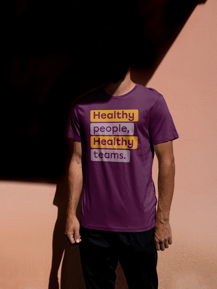
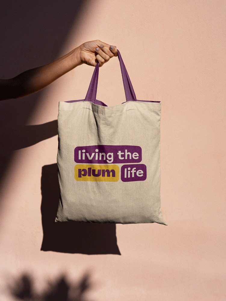
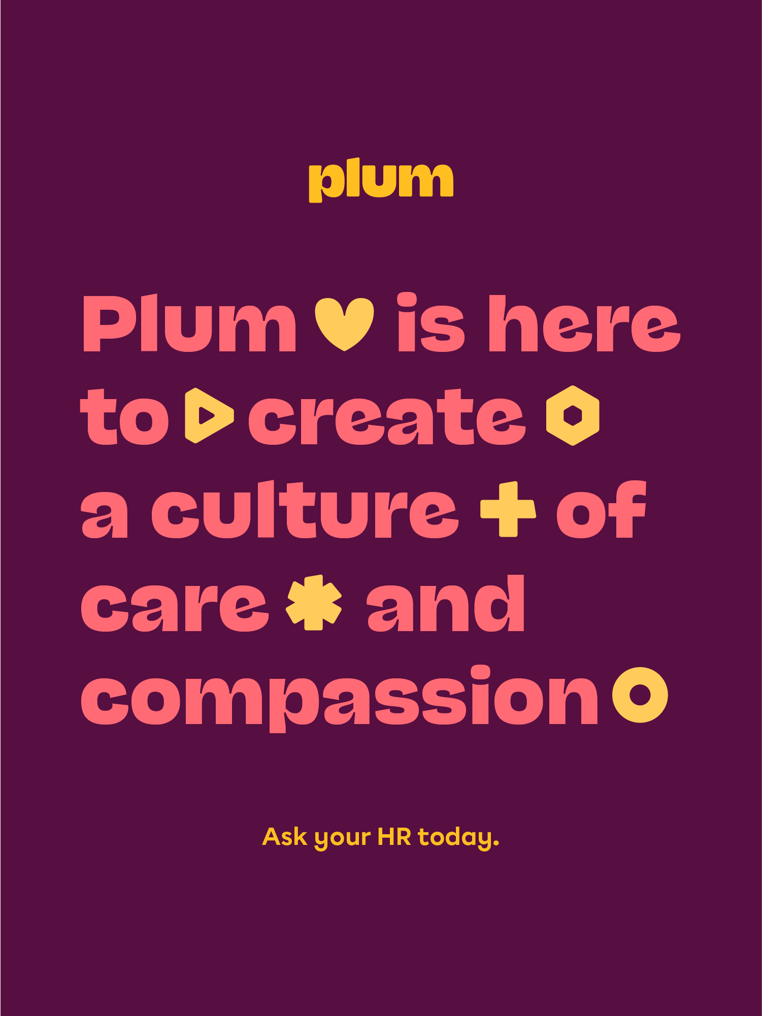
The logo was recreated leaving behind the fruit symbol, and instead a new wordmark was created customising the display typeface chosen for the brand - Nan Juane Midi Black. The letters were modified with rounded corners connoting the warmth and friendliness of Plum whilst maintaining a mature structure that showcases its commitment to vision. The type system was supported by Chromatica that lent a balance between geometric construction and humanist strokes.
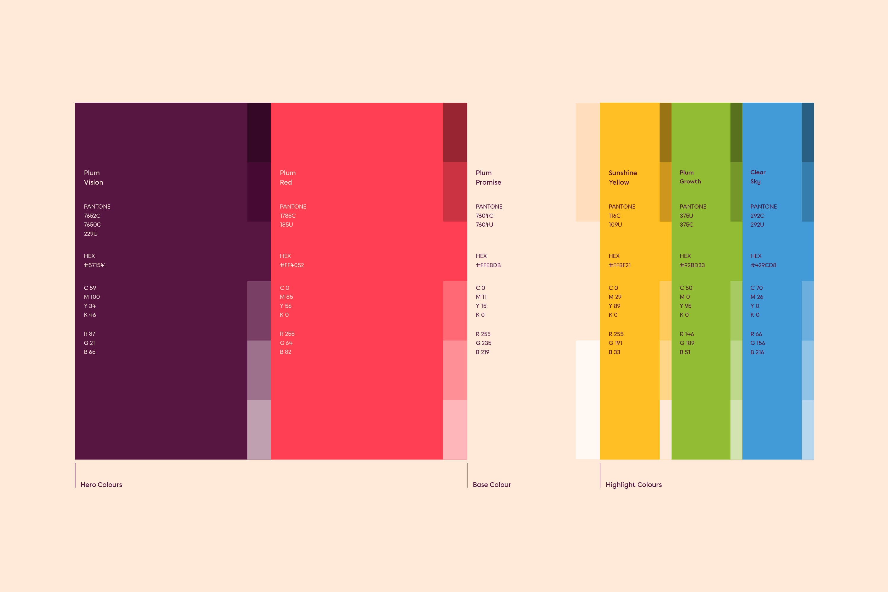
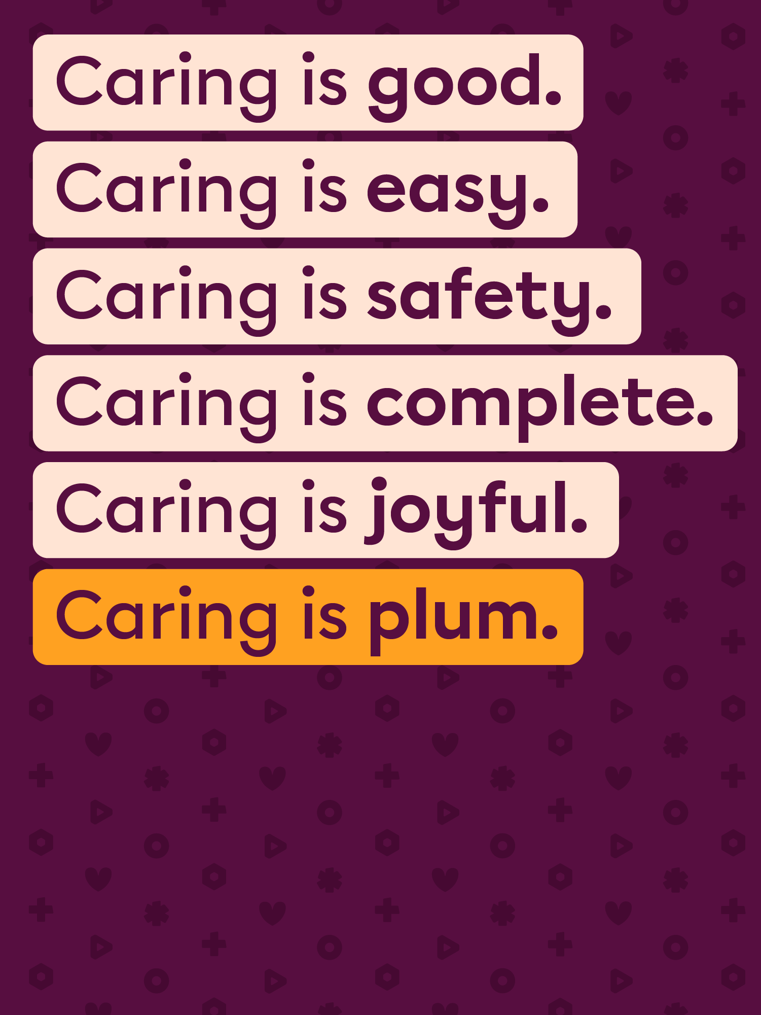
We stuck with the original ‘Plum Red’ as a primary colour combined with a family of saturated and supporting tones to give the brand a friendly, positive and joyful sense. With pairings and tints, the possibilities became endless yet well-bound.
THE RESULT
Plum's tone of voice is a summation of speaking in a manner that is
Grounded, not emotional and ‘saviour’ oriented
Involving, not preachy and speaking from a distant standpoint
Comprehensible, for an industry full of buzzwords
Witty, for a space that can easily sound intellectualised
We crafted values that drove internal action, transcending an adjectivised approach.
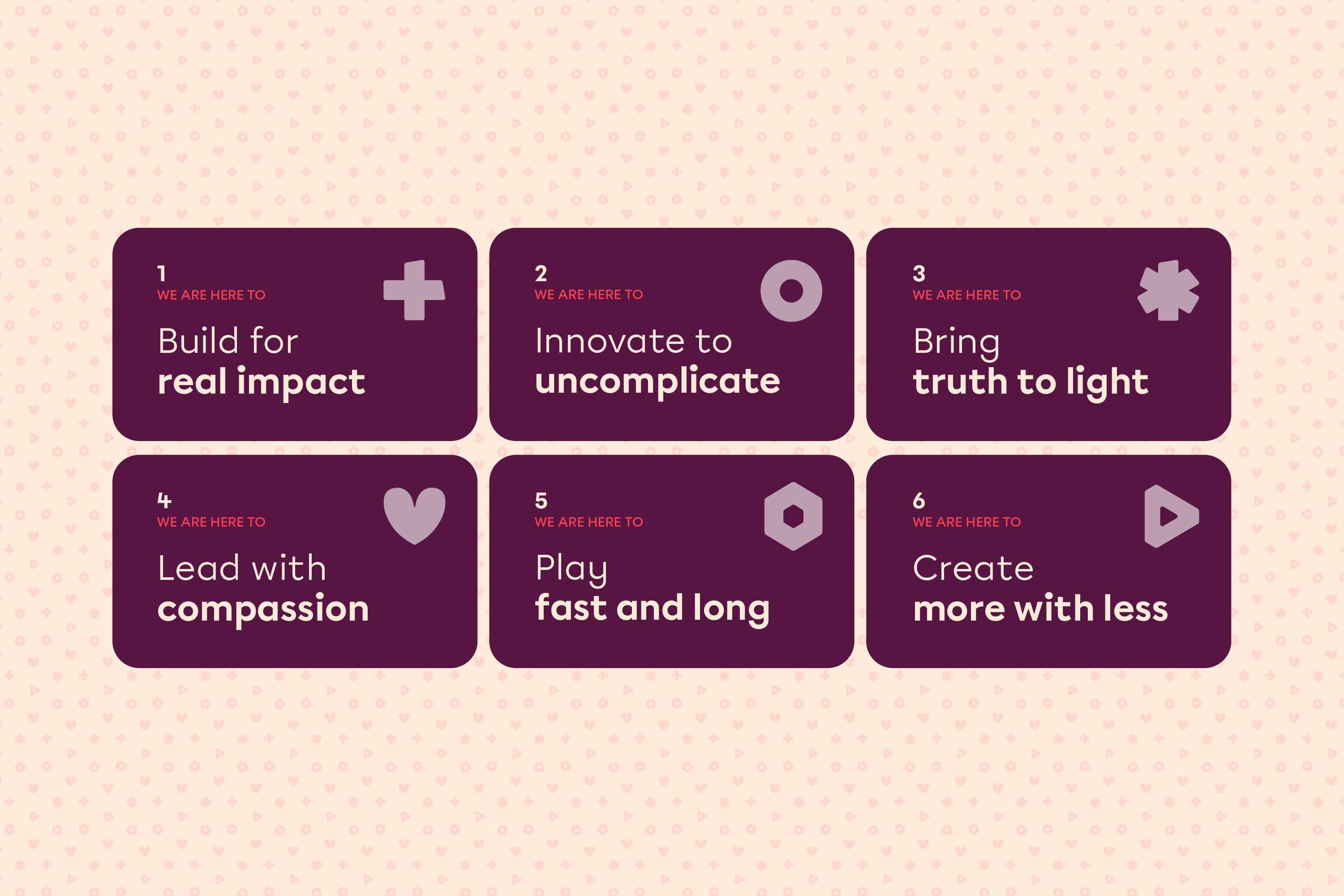
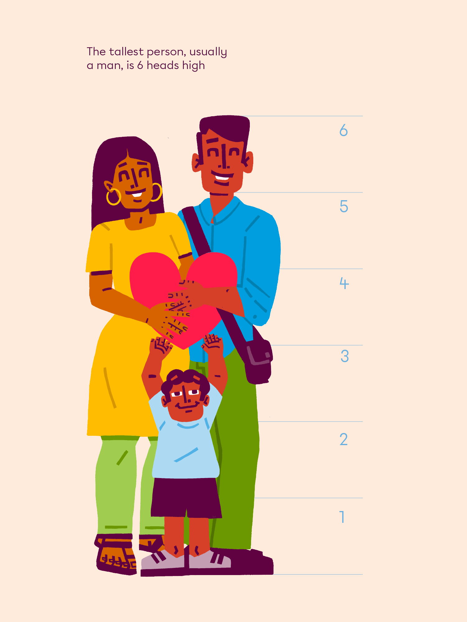
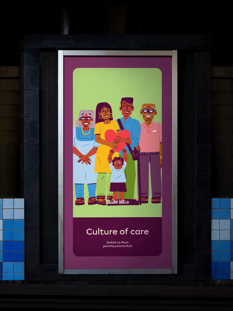
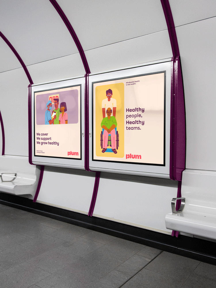
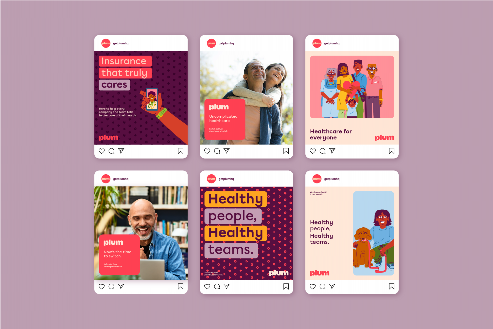
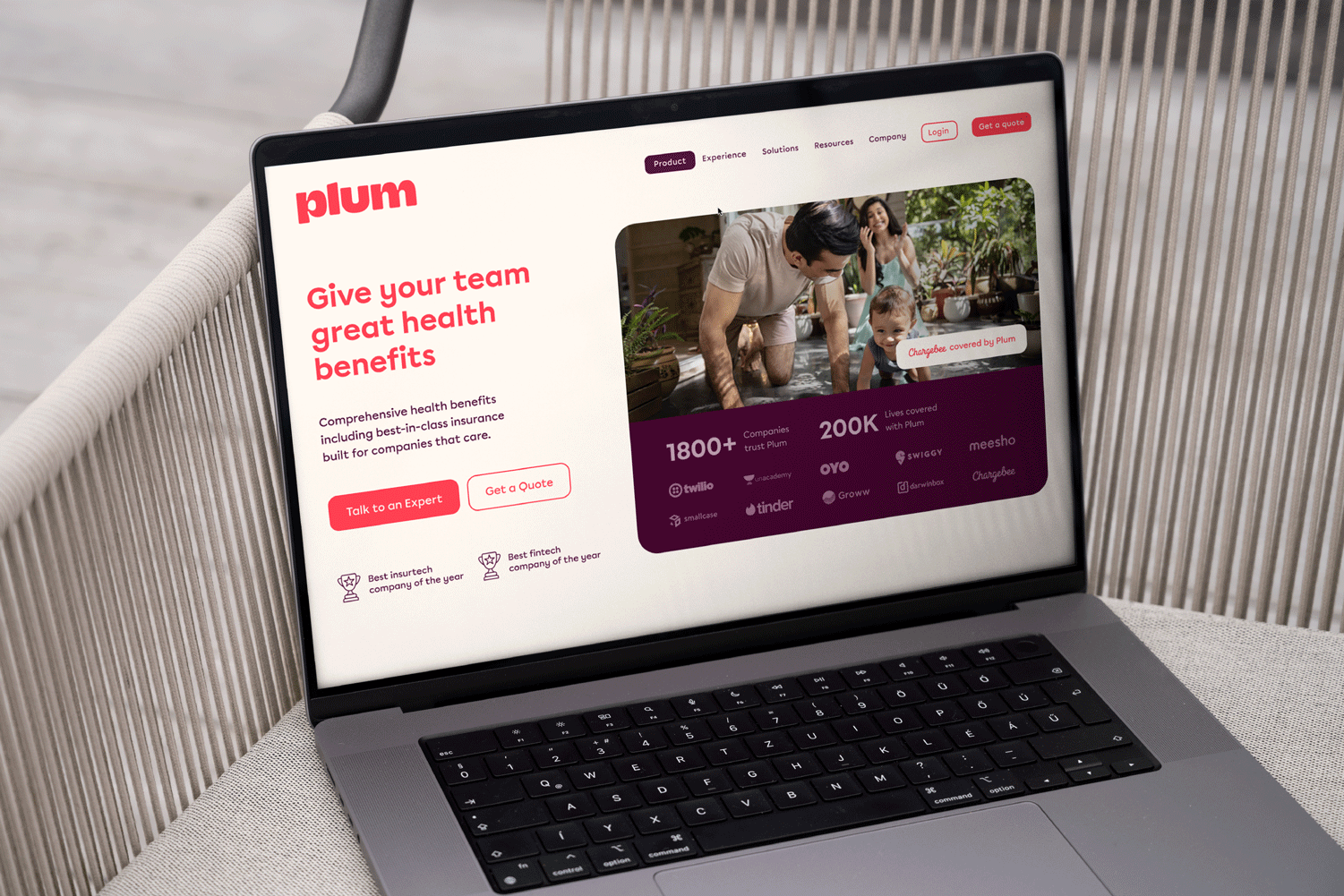
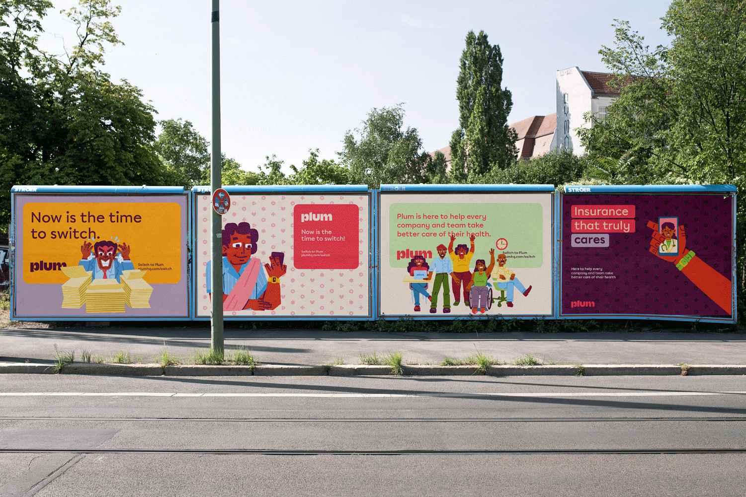
For the identity, we took these values forward and created a package of a new logoform, a friendly and warm colour assortment, humanist type, symbols and a family of illustrations that represent the very real problems Plum was here to solve.
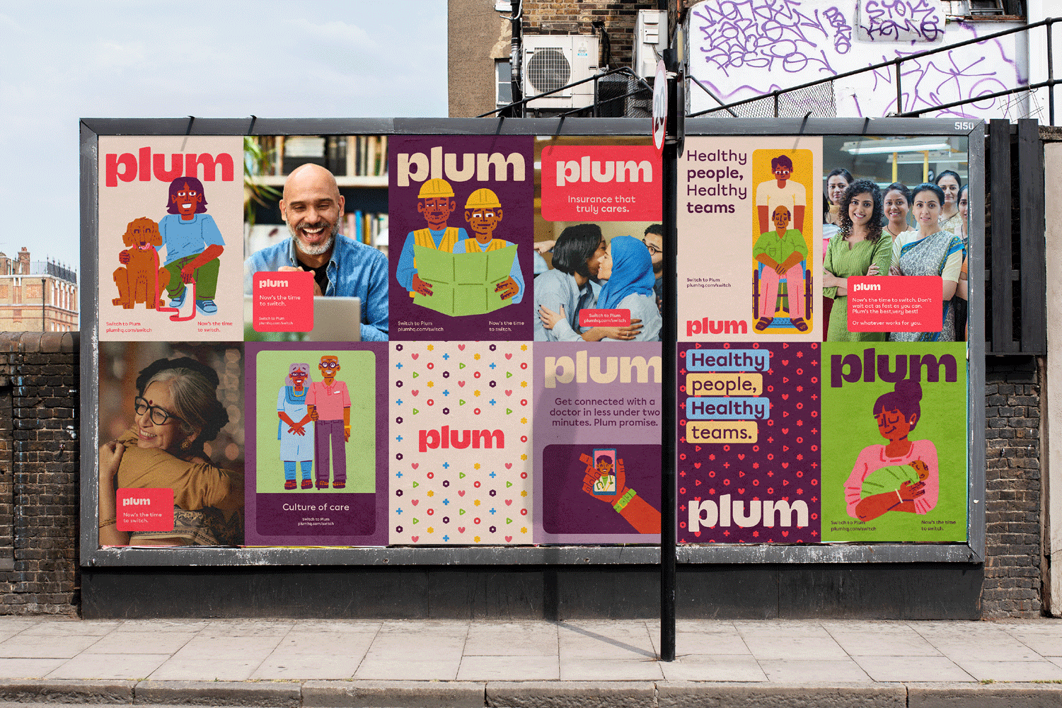
Plum emerged to be a positive player in the market as a challenger to the ‘quick return’ tones dominating the market.
In an overly commoditized health insurance industry that uses too much jargon, health sounds like a clinical service for very real human problems. Plum emerged as a partner rather than a service provider.


The Irregulars Alliance exists to enable the growth and prominence of the Indian art and design scene, and works to contribute to the Indian community culture. It is committed to fostering a workplace that is actively intentional about inclusion, diversity and creating a safe working environment for everyone. Our highest belief lies in the power of creativity and we are here to nurture creativity from the Indian peninsula. Read more soon about the internal Irregular happenings here.
Irregulars Alliance LLP
S-4, Khirki Extension, Malviya Nagar,
New Delhi, India - 110017
Say hi!
hello@irregularsalliance.com
New business
business@irregularsalliance.comom
Stay upto date with the latest from Irregulars!