CLIENT'S TEAM
MICHELLE PHAM
SHAHIN HAGHJOU
DAVID KARLSON
THE SITUATION
Rap 91 was a curated playlist on Spotify of the best of hip-hop in India. A fast growing genre, starting from street culture, it was brewing a loyal and passionate following.
In the past ten years or so, hip-hop culture burst on the scene in India, primarily starting from the slums and suburbs of Mumbai. Since then it had spread far and wide in the country, from Punjab to the North East, and even down south in Tamil Nadu.
We were invited to design an identity for the playlist. The question we explored in the spotlight was - while different cultures and languages embody their own familiar elements, could there be a common language for them all?
WHAT FOLLOWED
Our first thought on the identity was colour. Black & Yellow.
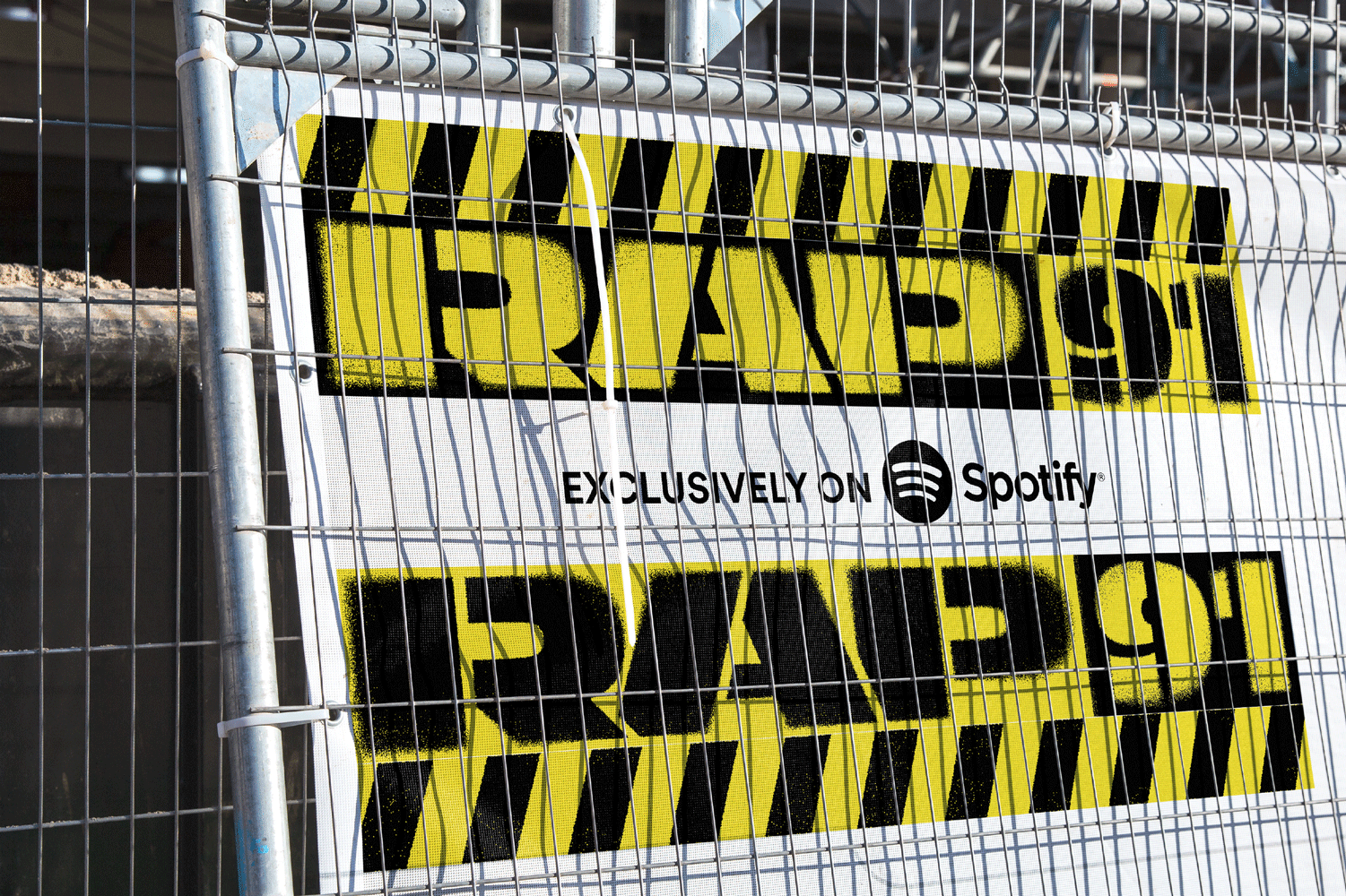
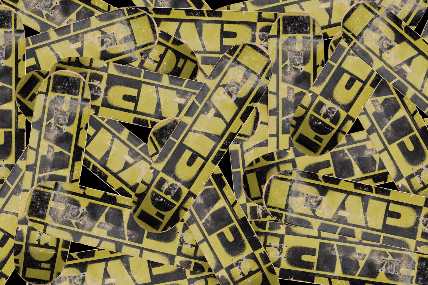
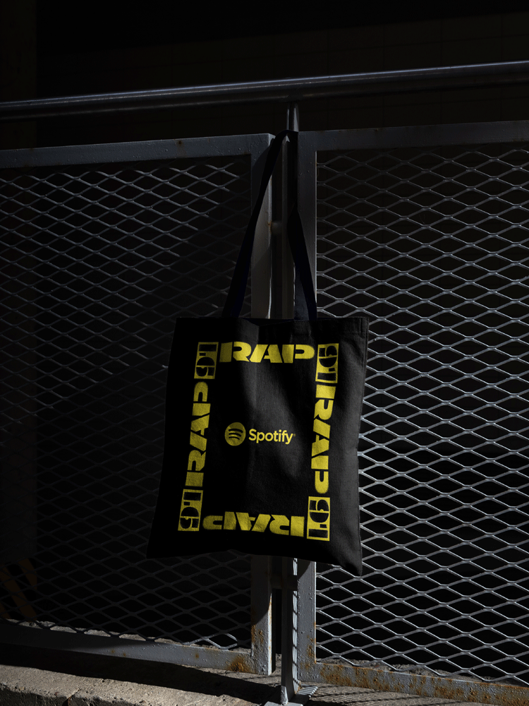
Taking inspiration from the streets, we sprayed up the lockup with a hand done spray paint effect that showed a bold play of alternation between the two colours in the background and foreground.
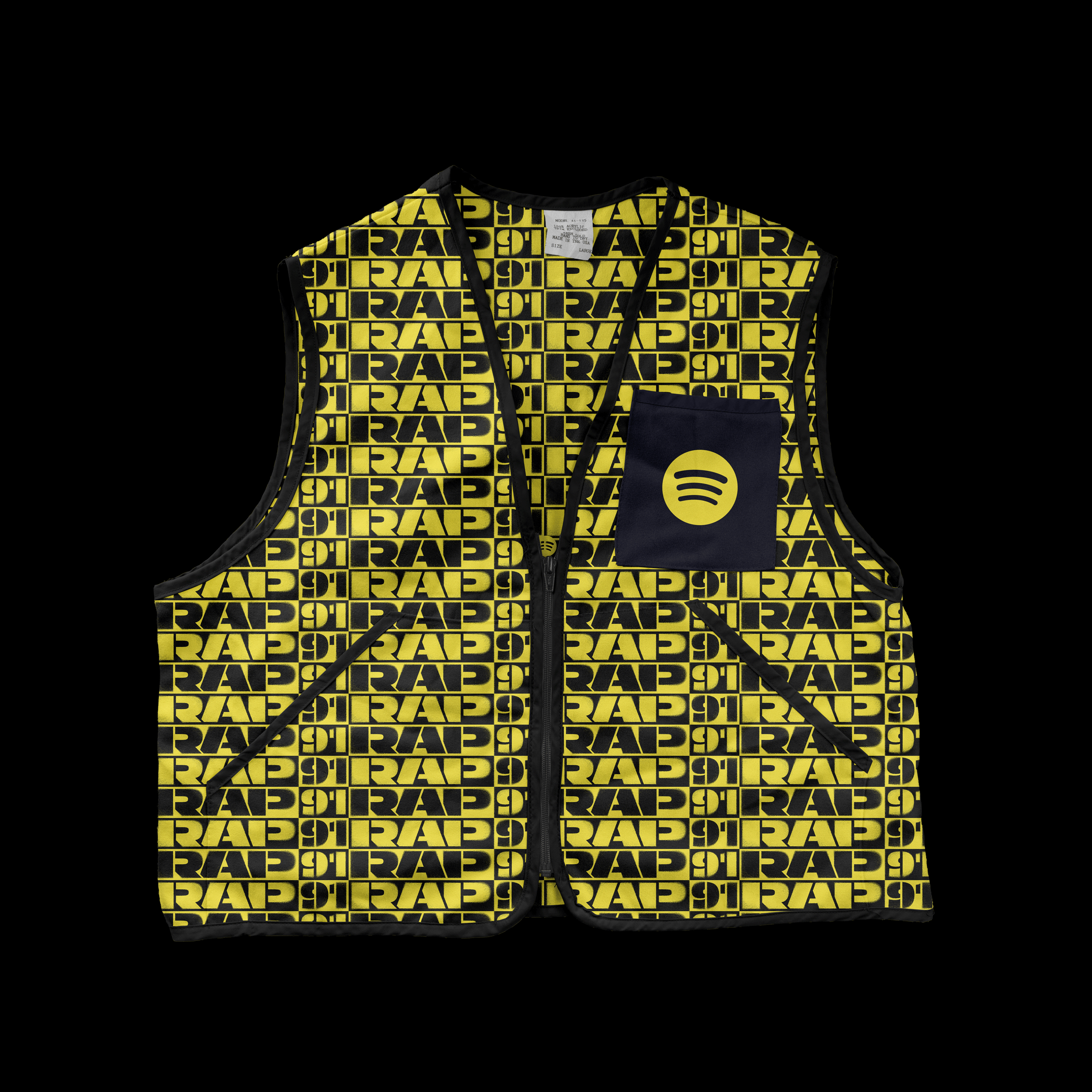
The lockup was repeated and rotated to create a pattern and a frame. We further played up the concept by creating a caution tape like graphic element that emphasised the feeling of danger on the streets.
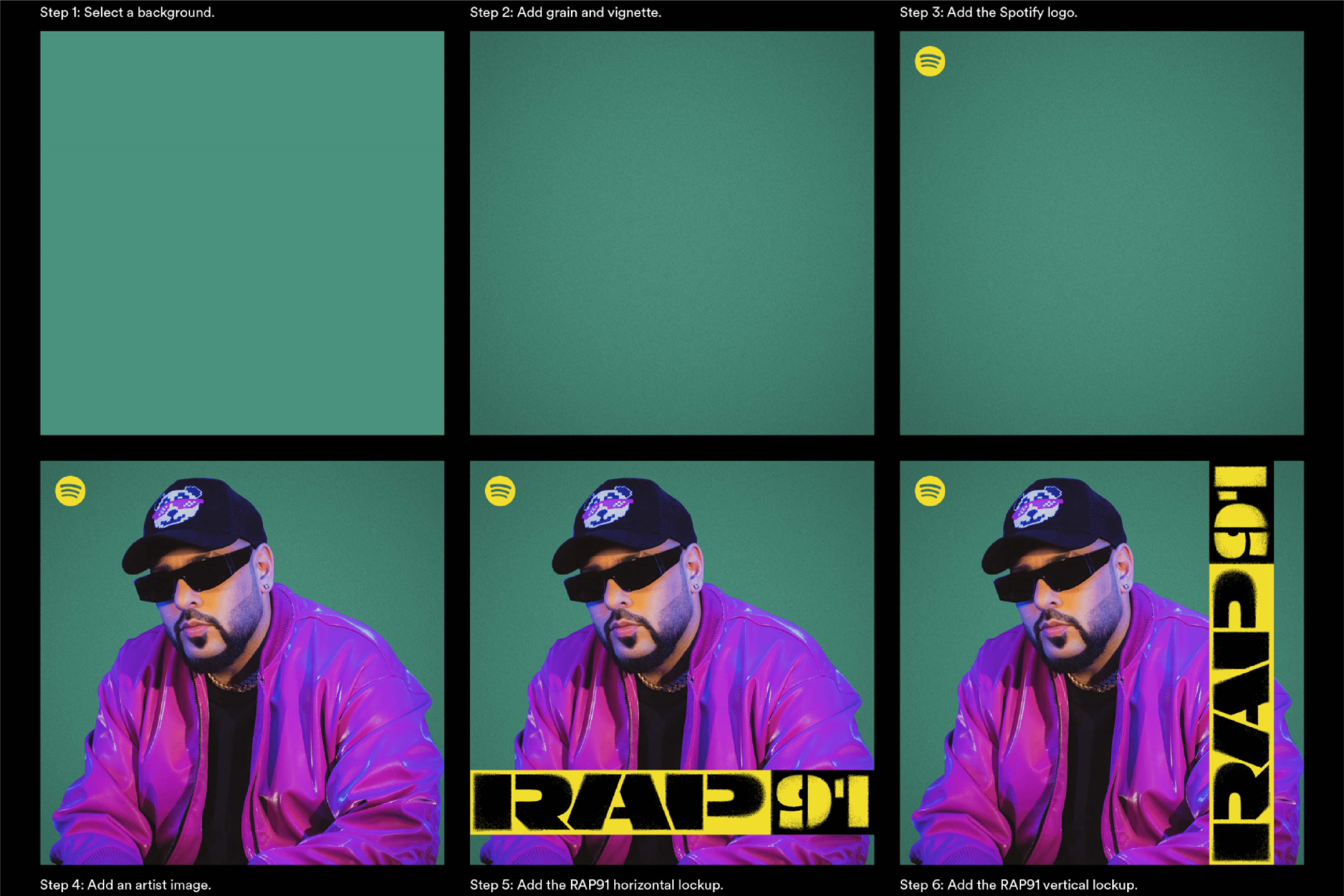
Keeping in mind Spotify’s unified design system and boundaries, photography and visual compositions were key to make the playlist stand out.
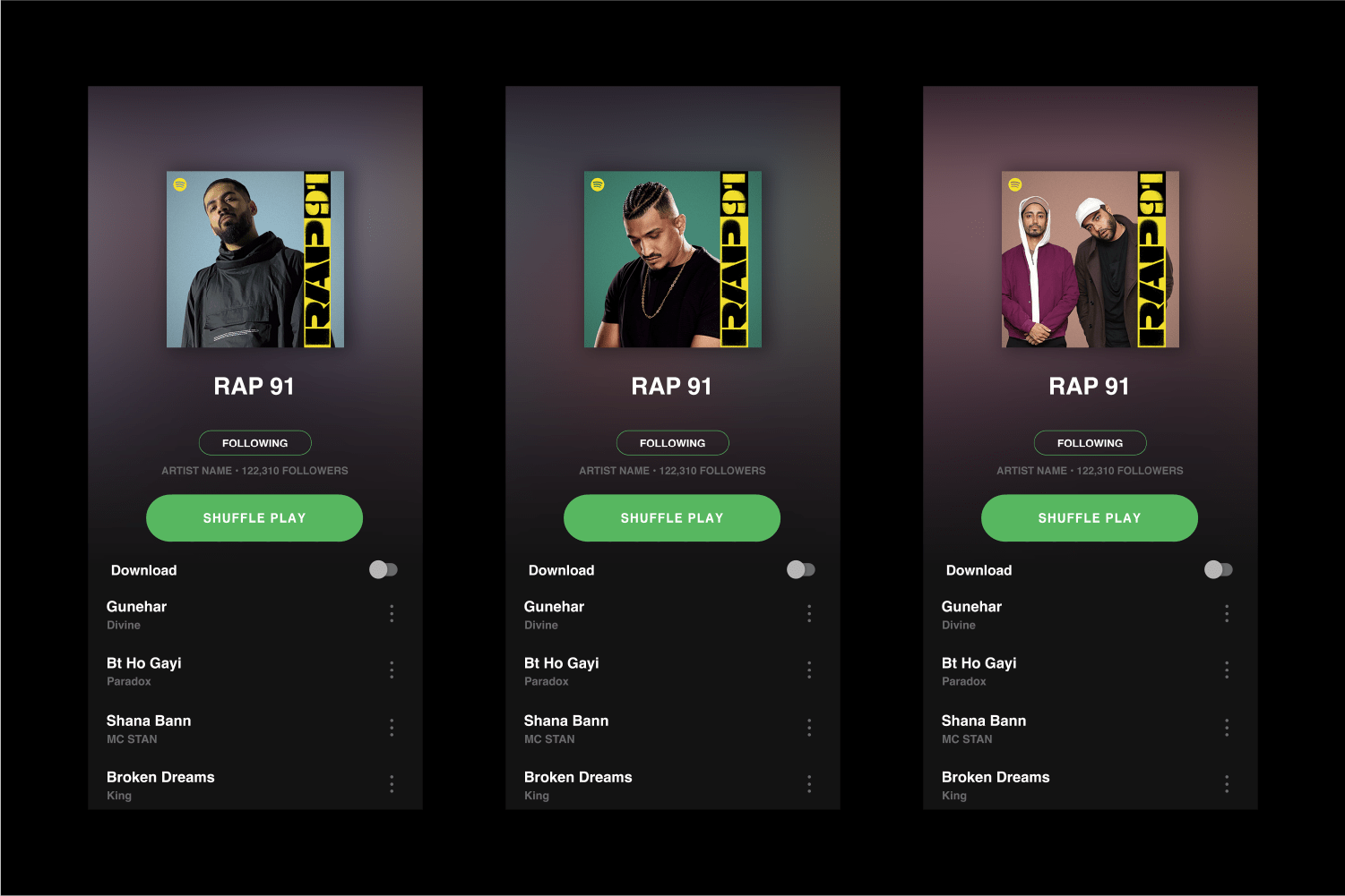
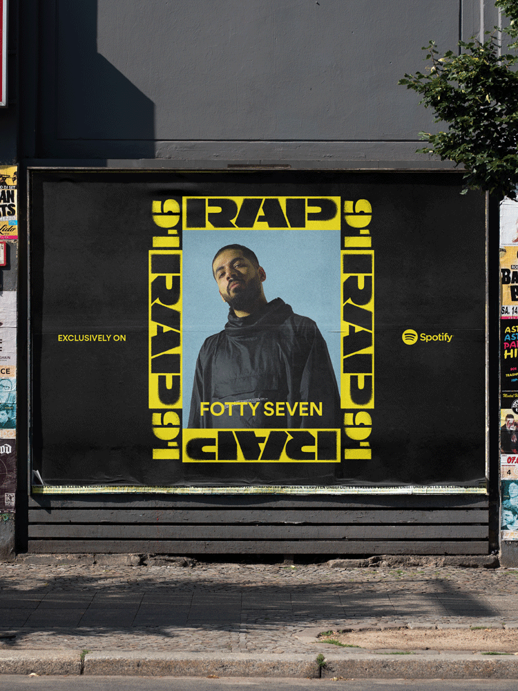
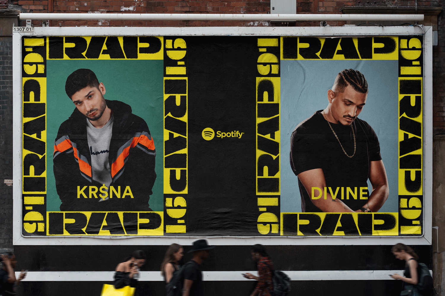
Our visuals were fresh with artist photograph cut-outs imposed against select background colours, featuring our logo in all its forms - horizontal strip, pattern and frame.

THE OUTCOME
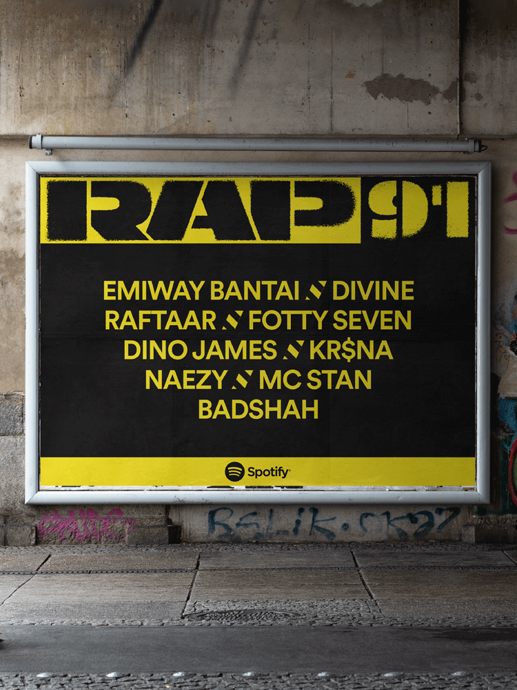
We meticulously slapped the identity onto motion graphics, beasty festival merch, space branding, posters and billboards, and a caution tape ofcourse!





The Irregulars Alliance exists to enable the growth and prominence of the Indian art and design scene, and works to contribute to the Indian community culture. It is committed to fostering a workplace that is actively intentional about inclusion, diversity and creating a safe working environment for everyone. Our highest belief lies in the power of creativity and we are here to nurture creativity from the Indian peninsula. Read more soon about the internal Irregular happenings here.
Irregulars Alliance LLP
A-9, Third Floor, C R Park,
New Delhi, India - 110048
Say hi!
hello@irregularsalliance.com
New business
business@irregularsalliance.com
Stay upto date with the latest from Irregulars!