THE SITUATION
John Jacobs is a breakthrough eyewear company founded in India. With great success, they brought Indian consumers the first of its kind high-quality eyewear brand with fashionable options at affordable prices.
With a new zest to, they were ready to move beyond being a segment oriented challenger brand, to make way for themselves in the market as a lifestyle brand. This brought in the opportunity to discover an entirely new brand DNA for the company and bring it to life with a refreshed identity.
OUR LENS
In a market that is comfortable viewing eyewear as a necessity, it was time to switch things up. We were convinced that the brand’s ability to bring a sense of ‘fashion’ and ‘statement mentality’ to eyewear was going to make for a cultural shift in the affordable eyewear market.
Taking to the intrinsic fluidity of fashion itself, we brought familiar questions to the mass eyewear space with John Jacobs.
Why does quality eyewear have to be a commitment?
Why does one have to feel stuck when you play so many different roles?

THE IDENTITY
We pivoted on the brand’s paradox between form and function, keeping our lens on the brand DNA to craft an entirely new identity.
The symbol shows two ‘J’s coming together, each representing the two extremes of the paradox. A symbol that portrays the intersection of the worlds of Art and Utility, making it a classic mark that is dynamic yet timeless.


Authentic
With a unique and fresh perspective on things. Here to build connections through frank conversations.
Irreverent
Here to challenge conventions and stereotypes. To go against the grain, and to stir things up.
Playful
With an abundant supply of creativity, we
invite you to hop on this roller coaster called life.


Further distilling their ideals we spiced things up with personality traits that would bring their identity to real form:
Iconic
Head-turning, high-style, fashion
World Class
Quality, thoughtful, meticulous
Charismatic
Intriguing, cultured, charming
Experimental
Fresh, unconventional, Multifaceted

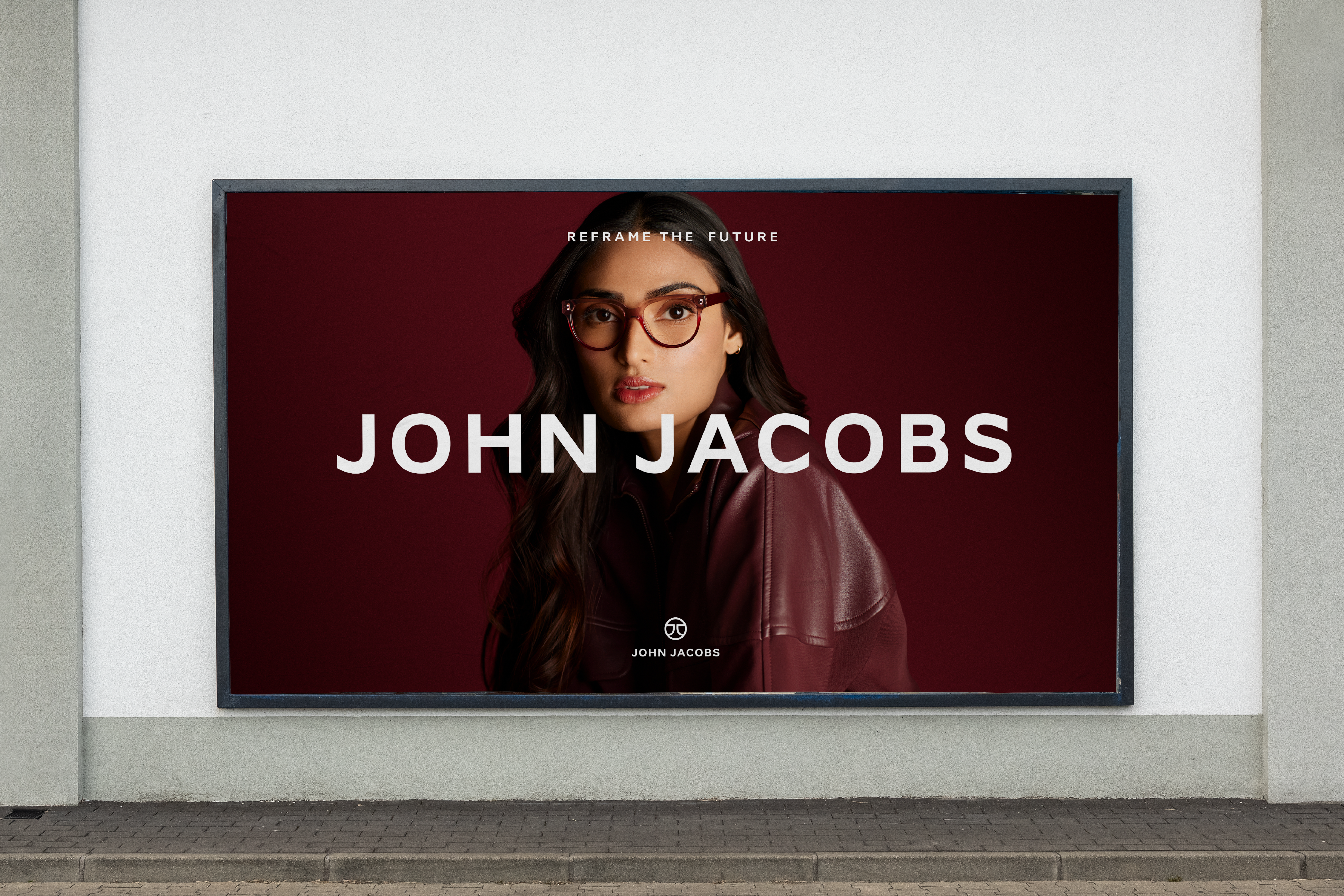

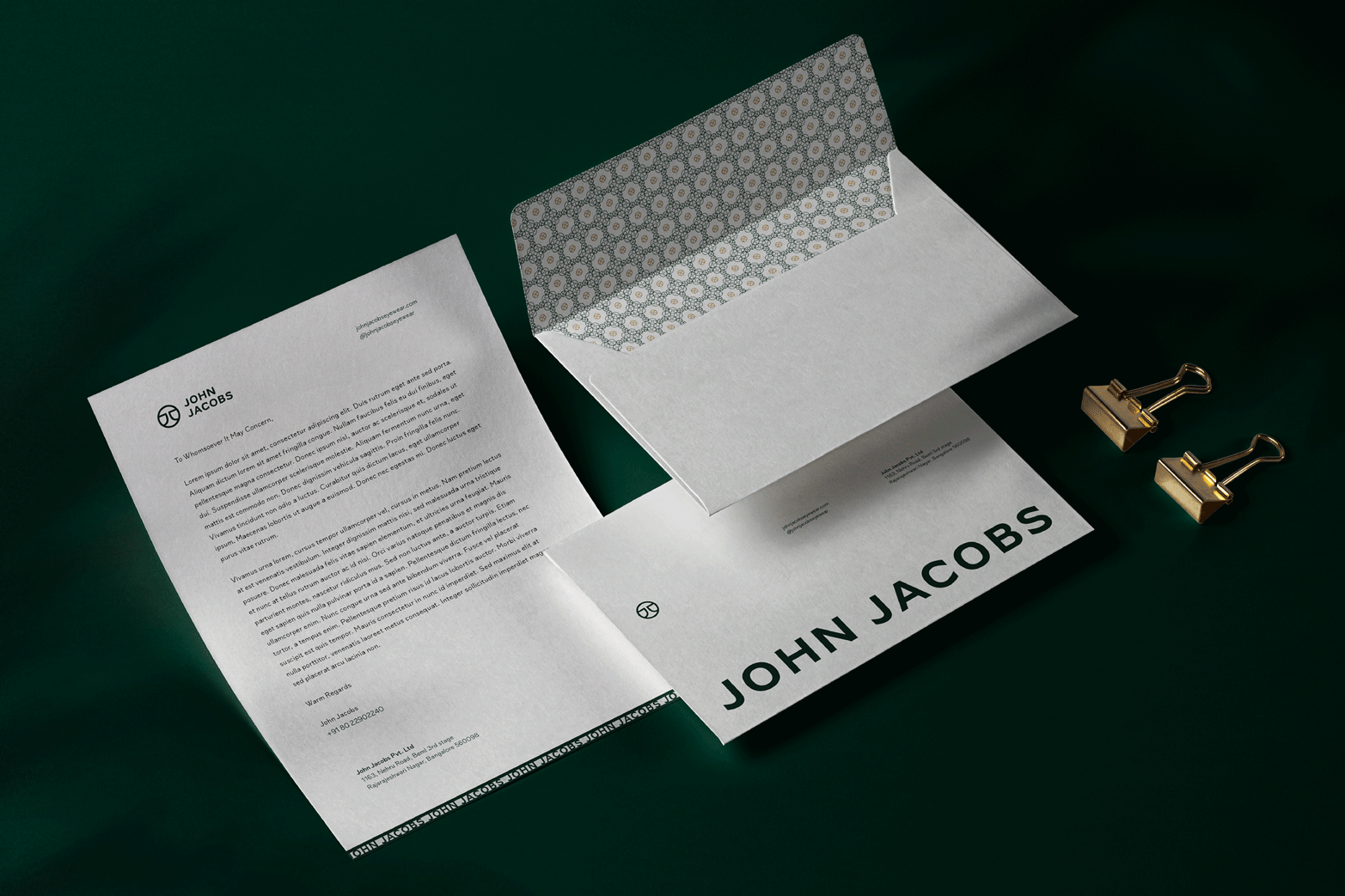
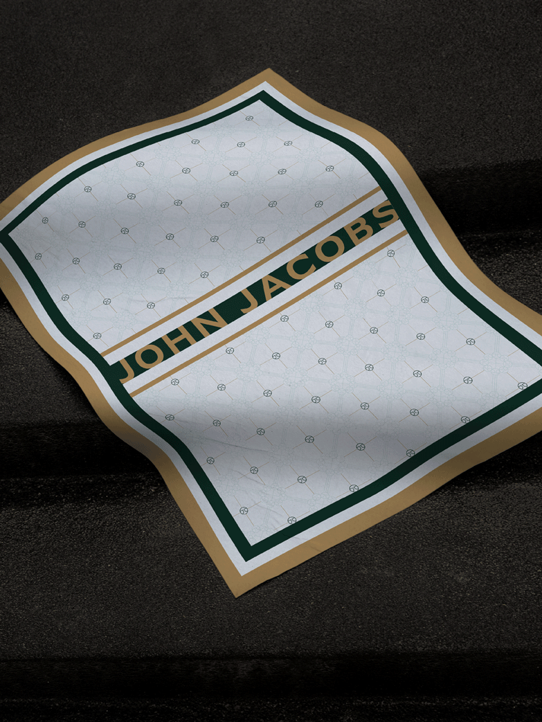
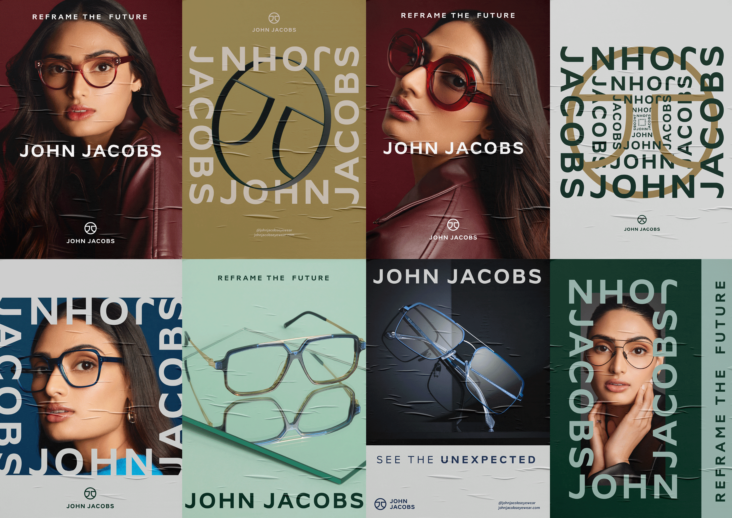
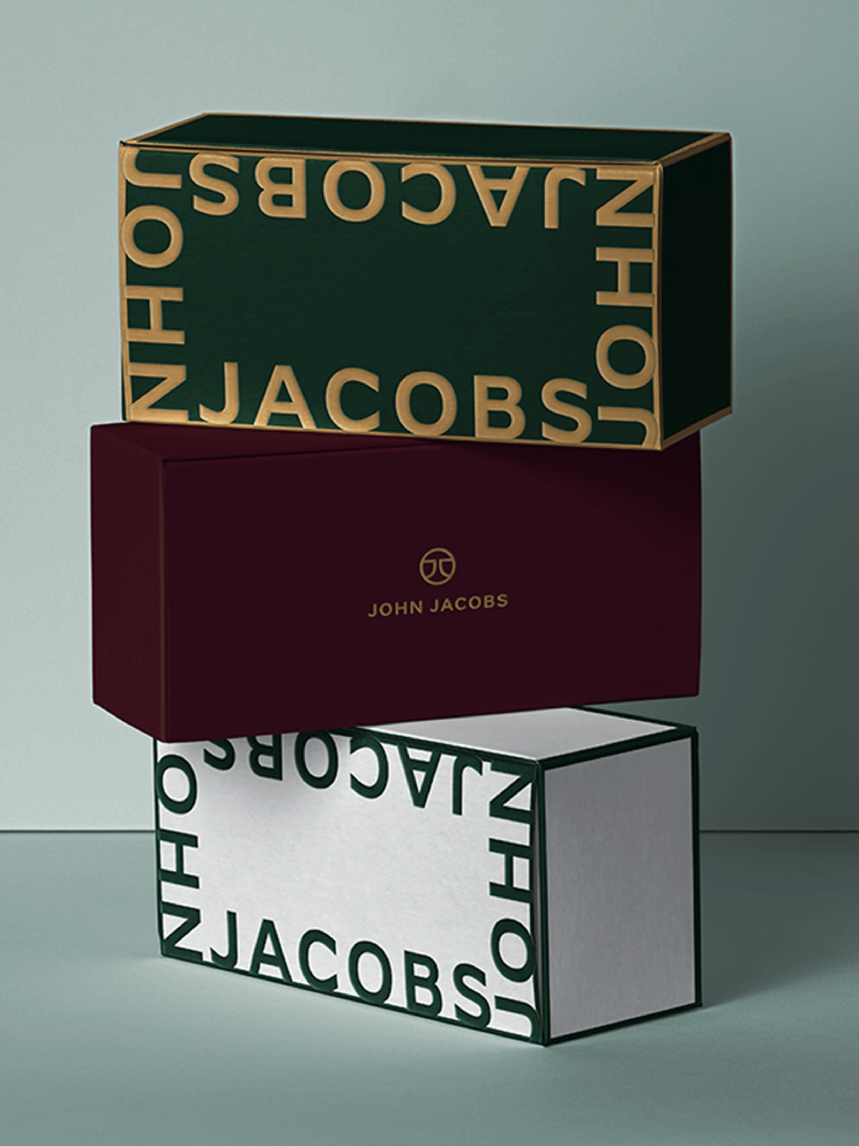
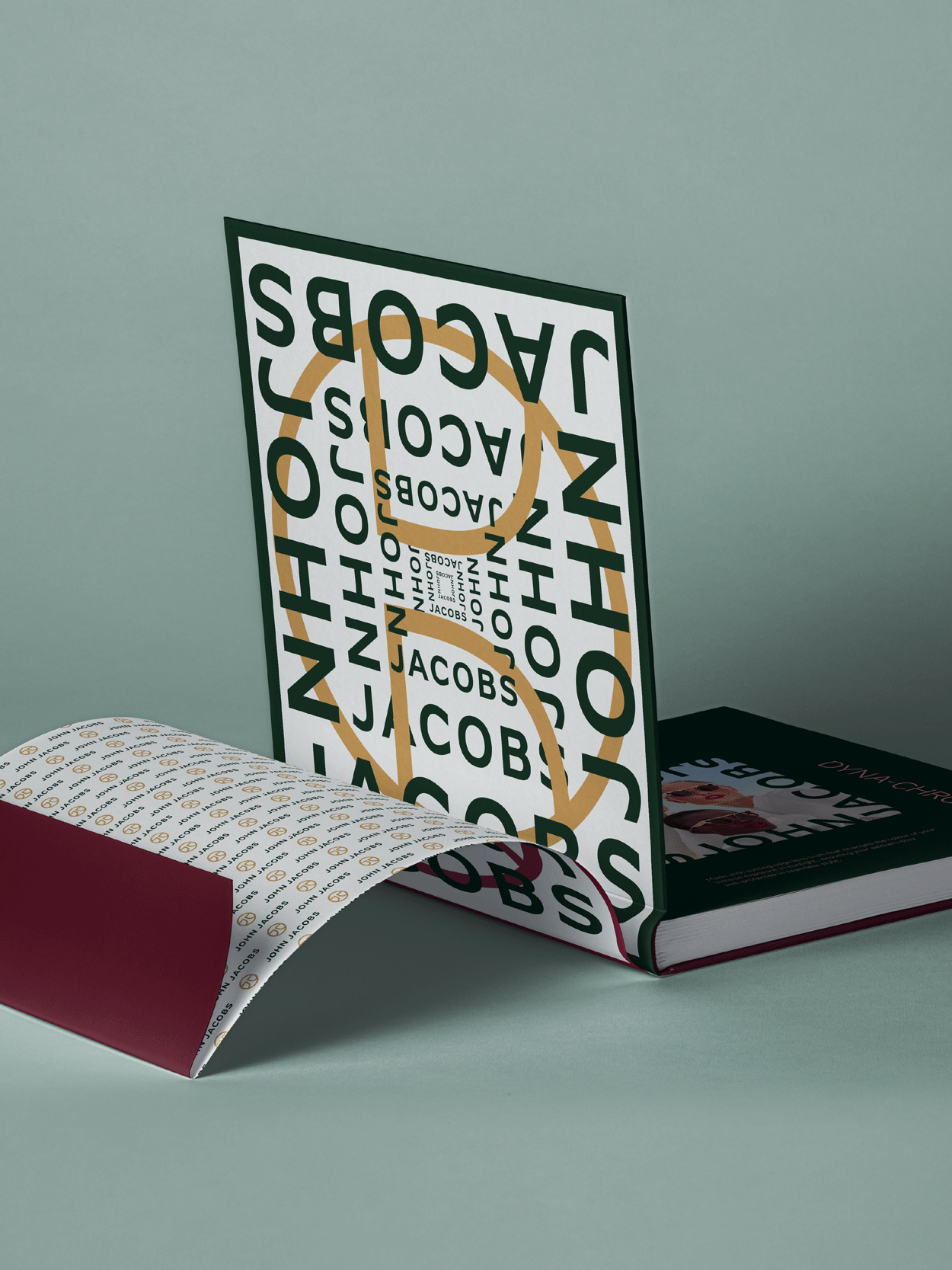
The guidelines cater to the brand’s entire ecosystem through culminating pairings, patterns, the grid, iconography, reflection and refraction and imagery and illustration. These were applied to various applications across digital, print, merchandise and an all new johnjacobseyewear.com.
The primary typeface we chose was Lyrra to bring a radical aesthetic that alternates between the organic and the mechanical. This paradox was further supported by Nunito Sans, a humanist sans serif typeface with an upright stress, open forms and a neutral, yet friendly appearance.
We brought all this together with a fresh and wide colour spectrum. One that creates a timeless identity through luxurious tints of iconic colours, switched up with seasonal colours that pop to portray the playful, trendy and fashion forward attributes of the business.

















The Irregulars Alliance exists to enable the growth and prominence of the Indian art and design scene, and works to contribute to the Indian community culture. It is committed to fostering a workplace that is actively intentional about inclusion, diversity and creating a safe working environment for everyone. Our highest belief lies in the power of creativity and we are here to nurture creativity from the Indian peninsula. Read more soon about the internal Irregular happenings here.
Irregulars Alliance LLP
A-9, Third Floor, C R Park,
New Delhi, India - 110048
Say hi!
hello@irregularsalliance.com
New business
business@irregularsalliance.com
Stay upto date with the latest from Irregulars!